Wednesday, November 28, 2012

How CSS Triangles Work

Just search on "CSS Triangles" or "CSS Tooltip Triangles" and you'll see lots of posts showing how to use CSS borders to achieve a triangle.

I saw lots of pictures of triangles where I could copy the CSS but I didn't immediately grok how it worked. (I guess I don't use thick borders very often.) So here are the pictures I wish I'd seen in sequence. The first one (showing how thick borders are beveled around inner content) is the key. After that, you just imagine the inner content getting squished so that all you have left is triangles. Hope this helps.

10 pixel borders on something with content

10 pixel border on something empty

Now just take the part you need

Use transparency on all sides except where you want the triangle.

Top

Left

Right

Bottom

For tooltip tails, you just need to position an empty tail element relative to your tooltip element, and use negative coordinates to move the visible part of the border adjacent to the tooltip. One common trick is to generate the tail using a pseudo element in the CSS. This snippet is for tooltips appearing above an element. It generates an empty element after (below) the tooltip with a red tail that points downward toward the element.

.above:after {
 position: absolute;
 display: block;
 border: 10px solid;
 border-color: red transparent transparent;
 left: 16px;
 bottom: -20px;
 content: '';
}

We are doing something like this in Orion, but the down side is that you end up with a flat tooltip (because only one element, the pseudo-element, renders the tail). For tooltips and tails with borders or shadows, you'll probably want to place multiple tail elements with different triangle effects. There are great examples out there so I won't cover that here. I just wanted to show the sequence of pictures that I wish I'd seen first.

Tuesday, November 6, 2012

Dropping into Orion: HTML5 Drag and Drop

One of our goals for the next Orion release (2.0) is to make it a lot easier to get your stuff in and out of Orion. We've always supported uploading files, using SFTP, and cloning git repositories, but one could argue that the non-git scenarios haven't always been...errrrr...very usable. After fighting with Orion too much to get some image files replaced in a web site I'm playing with, I figured it was worth the time to implement support for dropping files from the desktop into Orion.

There are already a number of good articles and examples out there to follow, and I'm sure some of this discussion will be obsolete soon enough, as browser support evolves. In this post, I'll focus on Orion's role as the drop target for desktop files and folders, and some finer details such as feature detection, drop effects, and some notable browser differences.

Good starting points

A quick search on "HTML5 drag and drop" will give you plenty of articles and examples to start with, many of them over three years old. Here are a few that were key to my understanding.

Devil in the details

Your first clue that you'll need to do a little digging is the second sentence in the spec.
"This specification does not define exactly what a drag-and-drop operation actually is."
The sentence is actually referring to the UI gesture, and the fact that it might not be the traditional mouse down, move, mouse up sequence. But I think it's a good mantra to keep in mind anyway. Your code and the user's browser ultimately control the operation semantics.

What can my browser do?

Detecting what's implemented is important for setting user expectation. I checked Modernizr to see what code is used to detect drag and drop support, and then quickly learned that detecting drag and drop support is not enough. For example, IE9 implements drag and drop, but not the file API that is needed to do desktop file drag and drop. You need to check for both. The Modernizr feature detect directory is a great place to browse the feature detection code. Using both of those checks, I can see if file drag/drop is supported.

var supportsFileDragDrop = 
   (('draggable' in myNode ) || ('ondragstart' in myNode && 'ondrop' in myNode )) &&
        !!(window.File && window.FileList && window.FileReader);

The Orion navigator logs the lack of drag and drop support to the console in this case, and doesn't bother trying to hook up any events.

What events to hook

By default, only certain kinds of DOM elements recognize drag and drop. You need to hook four events to tell the browser that you want your DOM element to be a drop target. One of the initial brain-benders in this API is that since the default behavior is NOT to be a drop target, you have to hook some events and prevent the default behavior and event propagation in order to cause the desired behavior to happen. This takes a little getting used to and has caused some major ranting about this API. The snippets below show you how to hook the events and minimally prevent the default browser processing. (These snippets are purposefully library independent, so perhaps a bit more verbose.)

  • dragenter is where you tell the browser that your node wants to be a drop target. As mentioned, you do this by preventing the default browser behavior. You might also want to set a class on your node to indicate that it is a drop target.
    node.addEventListener("dragenter", function(evt) {
       node.classList.add("dropTarget");
       evt.preventDefault();
       evt.stopPropagation();
    }, false); 
    
  • dragover is where you continue to express your undying loyalty to the idea of being a drop target. Again, you want to prevent the default event handling and bubbling. It sounds redundant, but this event gives you the opportunity in more complex scenarios to stop the drag if some state changes in your application.
    node.addEventListener("dragover", function(evt) {
       evt.preventDefault();
       evt.stopPropagation();
    }, false); 
    
  • drop is where the work for drop actually gets done. More on this soon enough.
  • dragleave gives you a chance to clean up when the drag operation is done. For example, if you added a class when the drag began, you can remove it when the drag is done.
    node.addEventListener("dragleave", function(evt) {
       node.classList.remove("dropTarget");
       evt.preventDefault();
       evt.stopPropagation();
    }, false); 
    

Handling dropped files

The dataTransfer property in the various drag events is where you can figure out what work to do. If your browser supports file drag and drop, this property should contain a list of files that are being dragged (or have been dropped.) You can use this to figure out if you want to accept the files or not. One caveat here is that folders will be in this list, also, and must be handled differently. In this snippet, we reverse engineer a way to tell if a file is indeed a folder.

node.addEventListener("drop", function(evt) {
   if (evt.dataTransfer.files && evt.dataTransfer.files.length > 0) {
      for (var i=0; i < evt.dataTransfer.files.length; i++) {
         var file = evt.dataTransfer.files[i];
         // this test is reverse engineered test for folders
         // see http://www.w3.org/TR/FileAPI/#file
         if (!file.length && (!file.type || file.type === "")) {
            window.console.log("Skipping directory " + file.name);
         } else {
     dropFile(file); // upload this file to the Orion server
         }
      }
   } 
   evt.preventDefault();
   evt.stopPropagation();
}, false);

Handling folders

Dragging files is useful, but if you have a folder structure you want to drag into the Orion navigator, you want more than files. You want the folder structure to be replicated on the Orion server. Fortunately, this is a common requirement and the Drag and Drop Entry API allows you to traverse folder structures. At the time of this writing, this specification is only supported on Chrome (since Chrome 21). We check for the file entry API in the drop event handler before reverting back to the file list.

node.addEventListener("drop", function(evt) {
   node.classList.remove("dragOver");
   // webkit supports testing for and traversing directories
   if (evt.dataTransfer.items && evt.dataTransfer.items.length > 0) {
      for (var i=0; i < evt.dataTransfer.items.length; i++) {
         var entry = null;
         if (typeof evt.dataTransfer.items[i].getAsEntry === "function") {
            entry = evt.dataTransfer.items[i].getAsEntry();
         } else if (typeof evt.dataTransfer.items[i].webkitGetAsEntry === "function") {
            entry = evt.dataTransfer.items[i].webkitGetAsEntry();
         }
         if (entry) {
            dropFileEntry(entry, null, targetFolder);
         } else {
            window.console.log("Error processing " + evt.dataTransfer.items[i]);
         }
      }
   } else {
      // entries not supported, do the file list handling.... 
   }
}, false);
The dropFileEntry function checks to see if the file is a folder. It will traverse the folder contents if needed, creating Orion server directories along the way. This code is a bit more complex, as it is using Orion's deferred file API's, but I think it's better to show the real thing than to contrive an example. Here we already have some json data representing the target folder object on the server. For simplicity, we log messages to the console rather than reporting in the UI.
function dropFileEntry(entry, path, target) {
   path = path || "";
   if (entry.isFile) {
      // can't drop files directly into workspace.
      if (target.Location.indexOf('/workspace') === 0){ //$NON-NLS-0$
         window.console.log("You cannot copy files directly into the workspace.  Create a folder first.");
      } else {
         entry.file(function(file) {
            performDrop(target, file);
         });
      }
   } else if (entry.isDirectory) {
      var dirReader = entry.createReader();
      // create a folder and then update the UI and traverse the folder content using our new folder as target
      fileClient.createFolder(target.Location, entry.name).then(function(subFolder) {
         explorer.changedItem(target, true);
         dirReader.readEntries(function(entries) {
            for (var i=0; i < entries.length; i++) {
               dropFileEntry(entries[i], path + entry.name + "/", subFolder);
            }
         });
      });
   }
}

Drop effects

One annoyance with my initial implementation was that the icon shown during drag said "Move". But uploading a file or folder to a server is most definitely a copy. The API supports this, but not all browsers do yet. To specify that a copy is going to happen, you need to set the dropEffect in both the "dragenter" and "dragover" events. (Setting it only the "dragenter" was not enough. I tried.) I also added a check on the effectAllowed flag to ensure that "copy" is supported by the drag source.

if (evt.dataTransfer.effectAllowed === "all" ||  
   evt.dataTransfer.effectAllowed === "uninitialized" || 
   evt.dataTransfer.effectAllowed.indexOf("copy") >= 0) {  
      // only supported in Chrome.
      evt.dataTransfer.dropEffect = "copy"; 
      node.classList.add("dragOver"); 
}   
This gives me a proper copy icon on Chrome.
Unfortunately we have a misleading "move" icon on Firefox. That issue is tracked in bugzilla.

Bleeding edge

If you've stumbled upon this post and it's not early November 2012, make sure you check all the spec and proposal links in this article to understand the state of the art for both the spec and for browser support. My goal here is to show you some code you can work with, but more importantly show you the places to check for the latest information, and also how to check to see what your browser can do. When searching for the latest and greatest, you'll want to be specific, not just about drag and drop, but about the File API and the Drag Entry API.

Friday, October 19, 2012

Commanding Orion's Editor

In a very readable (and pretty) post, Commanding Your Editor, Geoffrey Grosenbach claims that you can learn six simple commands, rather than hundreds, and instantly increase your productivity in your code editor. When I realized that the first two commands in Geoffrey's article weren't implemented by default in Orion, I thought it'd be fun to review the six commands, and how you might do the same kinds of things in Orion.

Orion's editor commands and key bindings are mostly borrowed from Eclipse, and we've not done a great job of exposing them to the end user. We've sometimes assumed people know them already from Eclipse or will figure them out. Given that we are seeing lots of activity on orionhub.org as folks try out Orion for the first time, it's probably a good time to go over some of the editor power commands. Let's start with Geoffrey's favorite six, and then add a few more.

The mighty six?

Delete whole words

The motivation is that if you have a typo, it's easier and faster to retype the whole word than to try to correct the part that's wrong. Orion doesn't specifically implement keystrokes for deleting the current, next, or previous word, but you can use Ctrl+Backspace to delete from your current position to the beginning of the word, or Ctrl+Del to delete from your position to the end. And you can use Ctrl+Left Arrow and Ctrl+Right Arrow to first navigate to the front or end of the word. I have to say that I'm much more likely to have already selected the word some other way (such as using Find) and then I simply type over it. So I haven't missed this command. If you can't live without a command to delete the current word, it sounds like the perfect candidate for an editor command extension (and perhaps I'll show how in my next post).

Add lines

Geoffrey's premise is that it's a lot faster to add a line above or below from anywhere in the line, rather than cursoring to the end of a line and hitting return. I must admit that the extra keystroke to cursor to beginning or end of a line hasn't bothered me. Once again, you'd need to write an editor command extension to get this exact functionality, but it'd be simple enough. Our current commands have evolved as committers add the ones that they miss the most.

In-file search

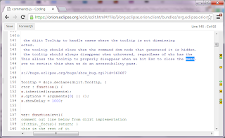
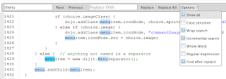
Now we're talking. Orion has a pretty advanced in-file search. Use Ctrl+F to open a prompt and type in the word you are looking for. You'll see the matches light up in the editor. You can move to the next match using Enter or Ctrl+K and the previous match using Shift+Enter or Ctrl+Shift+K. (You can also use the next and previous buttons in the prompt.) A number of options are available to you from the prompt menu to fine tune your search, including regular expressions.

Once you've found the word you are looking for, hit Escape to return focus to the editor, where you can type over that pesky incorrect word.

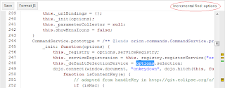
If you prefer not to move your eyes away from the editor cursor, Orion also provides an Incremental search mode (sometimes called live search in other editors) that doesn't open a prompt. To use incremental search, you use Ctrl+J to start live search. Your focus remains in the editor, but your typing applies to the search rather than the editor content. The editor status area in the toolbar will show you that you are in this mode. The editor will position you to the match (or give you a message in the toolbar if there's no match).

You can use Ctrl+J to move to the next match. Pressing Escape ends the mode.

Of course, since Orion is part of a larger development environment, you can also perform searches across multiple files and do global replacements. That's another topic completely, and is described pretty well in the Orion user doc.

Fuzzy file search

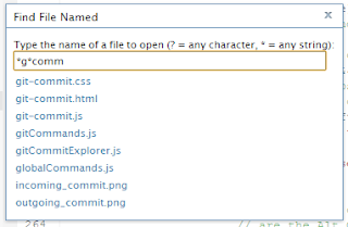
You can open other files in the editor using the Find File Named command, Ctrl+Shift+F. The popup will look for matching file names, in addition to initially offering you the files you've marked as favorites. You can use wildcards to find the file. (We could do better here, highlighting the part of the pattern that matches.)

If you are looking for path name matching, it's not currently supported from the file search. However, because the Orion editor is in a browser, you can find previously edited files by path name using the browser bar. You are of course at the mercy of your browser. Firefox does a pretty good job with this kind of path matching.

Automatic indentation

Orion's automatic indentation is pretty simple. It simply preserves the indent of the previous line. We don't (yet) recognize language specific blocks and indent. We do support automatic code formatting through plugins such as jsbeautifier.

Completion

Like Eclipse, you can invoke code completion using Ctrl+Space. Code completion has come a long way in Orion, thanks largely to the Esprima parsing engine and an Esprima-based plugin committed by our VMWare colleagues. Esprima-based content assist is now installed by default in Orion 1.0, so your code completions for JavaScript code are type-inferenced. Non-inferred proposals are also suggested (at the bottom of the list).

More mightiness

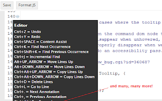
What else should you know? First and foremost, you should know that you can find a complete list of keybindings and commands in the Orion editor by pressing Alt+Shift+? (or Ctrl+Shift+? on Mac OS X).

Maximizing space

By default, the Orion editor opens with an outliner that lets you traverse your code by function. You can use Ctrl+O to hide the outliner. It's a toggle key, so you can use the same key binding to get the outliner back. You can also use Ctrl+Shift+M to "maximize" the editor, hiding the Orion banner and footer. This key is also a toggle. The end result is just the editor and its toolbar.

Navigating to errors

The Orion editor shows annotations in a ruler on the right of the source file. Most folks know you can click on these annotations, or hover on them, to find out about errors and warnings in your file. Power users know that you can quickly move between annotations using Ctrl+. to move forward, or Ctrl+, to move backward. This works great for correcting errors that our built-in jslint validator finds.

Toggle line comment

You can use Ctrl+/ to comment or uncomment a line of code. This works great when you are working with tracing logs or other debug code that you often toggle on and off.

Moving lines around

You can use Alt+Up Arrow and Alt+Down Arrow to move the current line up and down. If you have more than one line of text selected, you can use these commands to move multiple lines up and down without precisely selecting the whole lines. Adding the Ctrl key to use Ctrl+Alt+Up Arrow and Ctrl+Alt+Down Arrow will copy the line(s) around.

Deleting a line

You can use Ctrl+D to delete the current line. If you have more than one line of text selected, you can delete them all without precisely selecting the whole lines.

Goto line

You can use Ctrl+L to go to a particular line by line number. This is especially useful when you see an error in the browser debugger and you want to quickly go to the offending line in Orion.

Going forward

We certainly hope to do a better job of exposing all the powerful commands that the Orion editor provides. And we hope to see the community continue to add commands using our extension mechanisms. If you have your own ideas about "can't live without" editing commands, please consider writing an Orion plugin that contributes some of these! In a future post I'll show how simple that is. Some of our most powerful features started out as a plugin hosted at somebody else's site, and then became so widely adopted that they've been contributed back into the Orion base platform.

Thanks to Geoffrey Grosenbach for sparking the conversation (and for not naming his post something like "Six Brilliant Editor Commands You Must Know"). Thanks also to colleague Mark MacDonald for suggesting some of the Orion commands to mention (he is much more the power user than me!)

Thursday, October 4, 2012

More CSS, less JS: Orion Page Layout

We're in the "end game" of the Orion 1.0 release, and I realize that one of my bigger efforts won't surface in any of our end-user oriented New and Noteworthy lists. This summer, I revamped our JS-based approach for page layout and instead use mostly CSS for our layout and animation. Why didn't we do this in the first place? Here's a story about that.

Viewports and layout

Our very first Orion page was our editor. Given that a user might be editing a huge file, and working with only a small part of it, the editor does not render the entire document. It adds elements to the DOM as needed. The browser page can't do the scrolling since it doesn't know about the editor viewport. That meant we needed to pin the page footer to the bottom of the editor page, giving the editor the chunk of real estate between the header and footer.

We found that dijit's BorderContainer managed exactly this kind of layout and happily delegated the positioning work to this widget. This approach was adopted for the rest of our Orion pages. It didn't immediately occur to me that the editor layout was really a special case, until I started watching sites like github move to skinnier headers (and the requisite fatter footers). As footers became fatter (taller?), the fact that our footers were unnecessarily pinned to the page bottom really started to bother me. Shouldn't we be able to have a bottom area under a split main panel, but not have to pin it to the bottom?

The pain of a hybrid approach

That wasn't the only thing bugging me. Most of our UI implementation does not use dijit widgets. We have many of our own UI components, such as the editor, navigator, and compare view. We rely on dijit for things like menus, dropdowns and dialogs. It turns out that using dijit layout mechanisms to manage both dijit and non-dijit components is a pain. The dijit layouts very nicely handle the ripple associated with widget size changes and layout. But if your component is not a dijit widget, you end up with code that has to walk up the DOM looking for dijit layout managers to inform about what you've just done in the DOM. This just felt...errr....wrong. Note I'm not saying dijit layout is bad, just that a hybrid approach is bad. We needed to either embrace the dijit widget and layout model with all our components, or stop using dijit layout. The first idea wasn't viable because folks who consume our editor don't want to bring in a library they don't already use. And doesn't the rest of the world just use CSS?

Leaner layout

After looking at a few different grid systems and site templates, the first thing to decide was whether we were trying to build a generic grid and layout system or just solve our own problems. Orion plugins are either contributing behavior to our pages or linking to their own. Since it doesn't matter to us how you accomplish your layout, our solution needn't be too general or generic (a departure from our Eclipse thinking!)

Page regions

A quick tour of our pages showed that we have (at most) four regions to contend with. The header, the footer, an optional side panel, and main panel. The CSS classes use this terminology throughout. The model is one of a "side panel" defaulting to 1/3 width on the left and a "main panel" taking the rest of the room. A page always has a fixed header but may have a fluid footer (at the bottom of content) or a fixed footer on the bottom of the page. Part of the exercise in establishing this model was separating out the layout classes from the other styling, moving all of our layout related css to its own layout file.

Splitters

A missing piece was the splitter. By keeping the splitter very particular to Orion's model of a vertical split between side and main panel, this was only a couple hundred lines of JS, including reasonable documentation. Splitter classes in the CSS control the default positioning and animation effects. The splitter is the only JS code managing any of our main page layout.

CSS Transitions

We previously relied on dojo's animation features to animate the effect of the side panel opening and closing. Now we've adopted simple CSS transitions for animating this effect. The downside is that you won't see the animation at play in older browsers like IE9, but the upside is that the animation is smoother, faster, and less buggy.

Some details

If you read the CSS, you'll see it's mostly about the concepts I've described here. A few more details are involved.

Toolbars

Classes dealing with the toolbar ensure that the toolbar maintains a fixed vertical position and that message bars and input bars appear in the right place underneath the toolbar, letting the rest of the main panel scroll.

dijitManagesLayout

We have some CSS classes for pages to use if they are still using dijit layout widgets inside their implementation. At that point, it's up the page to deal with any "hybrid" problems when dijit is managing non-dijit widgets. We just need to know when dijit layout is taking over.

Fluid footers

So where are those fluid footers? Since our footer is still pretty skinny, there wasn't a crying a need to revisit the footer content and pinning behavior for 1.0. Even so, I'm very happy with the result of this effort. We got rid of a lot of code, the animations are smoother, the DOM is simpler to debug, and our CSS is better organized.

Monday, March 26, 2012

Delegated Content, Indirection, and the Two-Way Street

Seems like we just wrapped up the Orion 0.4 release, but the web never sleeps. One point of emphasis for our 0.5 effort is to develop a story for visual plugins. Our first stake in the ground when we started building Orion was that the browser should be the IDE, not Orion itself. In the cloud, your tools might come from anywhere, and our job in Orion is to provide pages for important development tasks (like JavaScript/HTML/CSS editing, managing code contributions, etc.) and an integration platform to let you seamlessly link to the pages needed to perform your development tasks.

In discussions about plugins and extension points, we have resisted the idea of the IDE mashup, where we provide visual extension points in the way that Eclipse defined views and editors. We want the user to use the browser (or browser extensions) to arrange the pages the way they see fit, building an IDE from task-focused pages. That said, we know that simply linking from Orion to tools at other sites is not a well integrated workflow. So one way of dipping our toe into the visual plugin waters is to provide a way for a plug-in to contribute page content that is wrapped inside the common Orion page "chrome." There is little, if any, interaction between the content and the chrome to start with. But by starting with some very shallow integrations that solve real world problems, we hope to advance the level of integration between third party content and the common Orion services.

Delegated content vs. consumable chrome

There are two directions, outward and inward, in which we can think about integrating third party content with Orion. With delegated content, we can provide an Orion page that has all the common page trim, but delegates its content outward to a plug-in. In a consumable chrome scenario, we provide a javascript library that can be consumed by a third party page. The page brings the Orion chrome inward, by making library calls that assemble the interesting links back to Orion. Both scenarios are reasonable ways to go about the problem, and we think that the things that content and chrome want to talk to each other about are the same in either case. Our first explorations have been with delegated content, for two reasons:
  • With delegated content, we can bring unmodified content into an Orion page that was developed without any knowledge of Orion. We can use sites with existing embedding conventions and web API inside of Orion. It's important to learn how far we can push this kind of integration. Can a usable workflow be built from parts that know nothing about each other?
  • Building a small, performant consumable chrome library requires some refactoring. Today, the Orion banner is rendered by pages in Orion, so the banner code has access to everything from the service registry and extension points to the Orion workspace. Refactoring this code so that a banner library could access Orion services remotely requires a bit more work, and a bit more understanding of the problem.

The most shallow integration

We start with a very shallow integration. We want to link to an external site from Orion, and launch it inside an Orion page so that the user can link back to Orion. Any number of simple integrations can be done in this manner. We'll use a WebChat plugin to show how it works. The plugin source is here.

We start by defining a new service extension point, orion.page.content. In its simplest form, this extension point describes the name of the visual plugin, the id of the contribution, and a URI Template that describes how to link to the content. The WebChat plugin looks like this:

provider.registerServiceProvider("orion.page.content", {}, {
    id: "orion.webchat.content",
    name: "Webchat",
    uriTemplate: "http://webchat.freenode.net?channels=eclipse-orion&uio=MT1mYWxzZSY5PXRydWUmMTE9MjI207"
});

The URL was obtained by using the "Add webchat to your site" wizard to create a custom URL that opens webchat up on the orion-dev IRC channel. To link to our new page from Orion, we add a link to the main Orion banner using the orion.page.link extension. The main point of interest here is that the href instructs Orion to open the content page (the Orion page that hosts delegated content) and specifies the id of the content provider. This id must match the id in the above extension point. The {OrionHome} variable is used to fully qualify the address to the content page.

provider.registerServiceProvider("orion.page.link", serviceImpl, {
    name: "Webchat",
    id: "orion.webchat.link",
    href: "{OrionHome}/content/content.html#,contentProvider=orion.webchat.content"
});

When the Webchat link is clicked, the delegated content page will be opened and the URI specified in the orion.page.content extension will be loaded into the page content. The end result is a webchat page wrapped in the Orion chrome.

This isn't too earth shattering, but already we have external content that looks like it belongs in Orion and can link back to orion via the banner.

Indirection from the workspace and back

A more interesting scenario is that of the remote editor. Web developers often need to edit more than just JavaScript, CSS, or HTML. One common task is to edit the images that are shown on a site. We decided to integrate a web-based image editor using the visual plugin idea. We chose the Pixlr image editor because it is written to be embedded in other pages, and it also has an API for launching the editor on remote content and configuring it in specific ways. Our goal was to implement an open/edit/save workflow using Orion extension points and the existing Pixlr API. In this scenario, the integrating plugin and the use of URI template variables provide a level of indirection that glues together the Orion and Pixlr API.

We start with two existing extension points, orion.edit.editor and orion.navigate.openWith. The editor extension defines an image editor and the link for opening it. You'll notice that the link is very similar to the Webchat link. The navigator extension associates this editor with files that have image content types.

provider.registerServiceProvider("orion.edit.editor", {}, {
    id: "orion.pixlr",
    name: "Pixlr Image Editor",
    uriTemplate: "{OrionHome}/content/content.html#{Location},contentProvider=orion.pixlr.content"
});
   
provider.registerServiceProvider("orion.navigate.openWith", {}, {
    editor: "orion.pixlr",
    contentType: ["image.gif", "image.jpeg", "image.ico", "image.png","image.tiff"]
});

If you followed the first example carefully, you'll already expect to see an orion.page.content extension point whose id is "orion.pixlr.content." The uriTemplate for the editor is using the delegated content page with the pixlr contentProvider id. There is also a new variable in the URI template, the {Location} variable. This variable will be filled in with the location of the resource on which the editor is opened.

The URI template used in the pixlr content extension is a bit more complicated than Webchat, because it uses the pixlr API to open pixlr on the image that was selected in the navigator.

provider.registerServiceProvider("orion.page.content", {}, {
    id: "orion.pixlr.content",
    name: "Pixlr",
    saveToken: ["imgapi?image=","imgapi&image="],
    saveTokenTerminator: "&",
    uriTemplate: "http://pixlr.com/editor/?image={OrionHome}{Location}&referrer=Orion&title={Name}&locktype=true&exit={ExitURL}&target={SaveURL}imgapi&locktitle=true,contentProvider=orion.pixlr.content"
});

The template opens pixlr, but uses the {OrionHome} and {Location} URI template parameters to tell Pixlr where to find the image file. Those variables will be set by the content page to the Orion installation and the location of the resource that was selected in the navigator. The {Name} variable fills in the name of the file, which Pixlr can use when showing the file. Armed with this information, Pixlr can be opened on the proper file. Since the hosting content page knows where the file lives in the workspace, the banner includes a complete breadcrumb and all related pages associated with that file.

While you're in the pixlr editor, there's nothing specific to Orion going on. However, when you get ready to save the file, you'll see that Orion is a possible destination for the save.

The appearance of Orion in the save dialog comes about because of the Pixlr invocation API. The referrer and target parameters give Pixlr a name and URL to use for saving the resulting file. When calling the provided URL, Pixlr provides a parameter that specifies the location of the saved file. The saveToken and saveTokenTerminator parameters for the extension point provide additional information for parsing the location out of the save URL. All of this means that when the user saves the file, Pixlr calls the provided Save URL, which is an Orion page. The content iframe now contains the save page, which can parse the URL to determine the location of the file and confirm with the user that the content should be saved back to Orion.
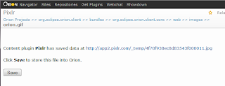
The workflow is not ideal, but is somewhat usable. Because the file save URL is invoked by Pixlr with an HTTP GET, the URL should be stable. It cannot actually store the file. Instead, we put up a page that lets the user approve the saving of the file back to Orion. A link to the file is provided so that the user can look at the file and make sure that it should be saved. These extra confirmation steps mean that the workflow is not ideal for an "edit/save/edit/save/edit/save" lifecycle, but it definitely saves the user the step of downloading an image, editing it, and uploading it back into the Orion workspace.

Toward a two-way street

So far, we've shown how you can integrate an editor using delegated content. Though the workflow is a bit clunky, what's promising about this scenario is that three domains are involved, and only one (the plugin code) knows about the integration. Orion hosts the page and renders the common page elements. A plugin hosted at github uses knowledge of the Pixlr API to describe an editor. The Pixlr site provides the content, using existing API, without any knowledge of its hosting page. We imagine that many more integrations of this type can be developed independently of Orion, providing some shallow but useful integrations. Add some additional indirection, such as web intents actions, and we could have a breadth of editing scenarios available in Orion.

The next step is to start working on a "two way street" concept. The examples here still use the "don't call us, we'll call you" model of Orion plugins. The Pixlr plugin extends Orion in specific ways, and it is called when Orion needs to do something with the plugin. We also make a lot of simplifying assumptions in the code that allow this scenario to work. The fact that we implement our own page to receive the save request means that we can develop our own internal handshake for having the save page signal the outer page that the workspace save should be performed. If instead, we implemented some service APIs that plugins could use to talk to the host page, we could provide even better integration.

  • So far, the remote content is available to Pixlr only when the Orion workspace is "world readable." So data hosted on orionhub will be visible to Pixlr, but data from your localhost would not be. We need to come up with a more general story for exporting data from Orion to a publicly readable space on the web (with user permission.)
  • The save scenario only works because Pixlr lets us specify a save URL, and we have developed a page that performs the save. We also use a specific window.postMessage handshake for the inner save page to signal the outer page that save should happen. We'd like to expose the file service in some way to the plugin so that the save could be performed directly by the plugin. Even for plugins unaware of Orion, the Orion save page could use API to perform the save rather than signal the host page to do it.
  • You likely noticed that the Pixlr editor has its own menu bar, while the Orion toolbar is empty. Imagine an Orion-aware remote editor that instead contributed commands to the Orion toolbar.
  • Allowing Pixlr to post progress, status, or error information to the Orion page would improve the integration. Likewise, it would be nice if any prompts or confirmations would be performed by the outer page.
  • The keybindings inside and outside the content iframe are completely different. It'd be nice to see some of the common Orion bindings work even when focus is in the inner content area.

As you can see, even the simplest integration attempts produce a pretty good laundry list of what we'd like to see. We'll continue to deepen these integrations throughout the 0.5 release. In the meantime, we invite you to try to integrate your favorite tool into Orion and let us know how it goes.

Monday, February 27, 2012

The Power of Semantics

Last month, I wrote about our attempts to build a semi-formal anatomy of Orion's common page elements. This anatomy seemed more important than focusing too strongly on a particular visual look or layouts. I also (somewhat optimistically) asserted that by the time we finish 0.4 you wouldn't have to think about this anatomy, but instead would simply think, "wow, these guys always get those links and buttons in just the place I expect them to be!"

So, how'd we do? Release 0.4 is done for all practical purposes. The M2 new and noteworthy gives a taste of what we've been up to lately, and the summary of all the 0.4 new and noteworthy should be out in a couple of days. I think it's important, though, to spend time thinking about some of our new features in terms of both "syntax" and "semantics."

In the web world, we all know about separation of styling (CSS) from the structure and content (HTML elements) on a page. But I'm talking about a distinction that goes beyond styling vs. structure. In the context of what's on a web page, I think of the styling and structure (layout, colors, fonts, buttons, graphics, words) as our syntax. The semantics are really the meaning behind that structure. Why do the various parts of the page appear where they do? How did we end up with those elements? Describing an additional level of semantics can help us not only design better pages, but provide function in ways we hadn't imagined before.

So I'd like to look at a few new Orion features in 0.4. For every screenshot of something new, I'd like to discuss not only the feature, but where we've made strides in the semantics behind it, and how this can help Orion get even better.

"New look" in the Orion page header

In Orion 0.4, you'll notice a new look. The header is divided into a skinnier common banner at the top and a taller page heading below.

Syntax

From a presentation point of view, there are many things to notice. Some are simply stylistic changes, some represent a little more thought about the user tasks and workflows.

  • It's lighter and brighter than the previous gray, more contrast at the top.
  • Different fonts and colors than before.
  • The static part (logo, navigation links, user profile) is separated visually from the dynamic part (page title, breadcrumb, etc.)
  • The static part makes the header feel skinnier, while the dynamic part leaves more room for potentially lengthy content, such as a very long path name.

Semantics

The items in the header are powered by a page anatomy. The idea here is that if a page can say a few things about itself to the common header code, the header can figure out how to present it in terms of a title, a breadcrumb, and a location. There is still work to do on the API side, but I think focusing on the structure of a page and how it influences the heading is laying the groundwork for future improvement. A page that can describe itself semantically can inherit interesting common function that goes beyond the presentation. For example, let's consider another feature in Orion 0.4 that is powered by the same idea.

"Related pages" menu

One of the usability goals for Orion 0.4 was to make it easier to move around within Orion. We wanted to identify the common workflows and make sure it's easy to move within or between pages to accomplish a task. So we've added a "Related pages" menu that gives you a handful of choices for other pages you might be interested in, based on what you are working with on the current page.

Syntax

One reaction to this feature could be, "it's about time." What's so hard about adding a link on the editor page to "Git Status" when the file I'm editing is in a git repository? I suppose we could add features like this a little faster if we just added them rather than think about them in a generic sense. But if we know that from any Orion page, there is a handful of pages that the user will likely want to go to, isn't it nice that we can put them all in place? It's useful to think about the general case when designing a specific usability improvement. But even so, that's definitely in the "syntax" realm.

Semantics

The semantics behind "Related pages" gets more interesting. It's one thing for a page to be able to list the links to pages of interest. However, Orion is an extensible system, and we don't want every page to have to consider what other pages might be around. So some semantics that allow a page to say what it is showing, and what other things it might care about, rather than just itemizing links of related pages, can let us build more interesting relationships between pages. For example, consider this "Related pages" menu from the Orion git repository page:

Here, the user is working in Orion with a git repository that is hosted at GitHub. So we figure out that one place the user might want to go is to that repository's GitHub page. This relationship can be determined because of some built-in semantics.

  • The page is able to call some common code that basically says, "hey, I'm a page that deals with repositories. Here's the URL I'm showing."
  • Another part of the code says, "I'd like to parse URLs and look for GitHub pages."
  • Finally, a related pages extension is used to establish that the "GitHub URL" command should be consulted when building the "Related pages" menu.
The way of expressing these relationships with API still needs work, but we have some pretty cool ideas of how we can make "Related pages" even more useful:
  • We could use the link scanner extension point so that any links built by the scanner in the Orion page content could also become candidates for "Related pages." For example, imagine a Bugzilla link showing up in the "Related pages" menu because you referred to a bug in your code.
  • We could develop a URL translating syntax so that plugins can more easily contribute mappings from page content to external links

Get Plugins

One of my favorite new features in Orion is the workflow for getting new plugins. Our community is growing, and more folks are writing interesting plugins. We currently don't have an "official" plugin catalog or store, but my teammate Mark MacDonald has been hosting a plugin listing on a page in his GitHub repository. We wanted to make this catalog more noticeable and reduce the steps needed to install a plug-in.

Syntax

The link appears in the banner because the orion.page.link extension is used to specify a URL that should appear in the Orion banner. The links can refer to pages inside or outside of Orion. In this particular case, the link takes the user to Mark's catalog.

Nothing earth-shattering here, but suppose we click on one of these Install links. The link takes us back to Orion, ready to install the plugin we clicked.

If you aren't paying close attention while you click these links, you might simply think that our plugin catalog didn't catch up to the new look for Orion. But the reality is that this workflow took the user out of Orion to a third-party plugin catalog, and links from that catalog were able to bring the user back into Orion at the correct page, with the correct information filled in for installing a plugin. The reason this is one of my favorite new features in Orion is that we were able to add this at the end of the 0.4 release cycle without inventing any new generic constructs.

Semantics

The semantics that allow this scenario to work have been covered in my previous blog posts, but it's kind of cool to review how they all play together in this workflow.

  • Our simple orion.page.link extension adds a link to the catalog. This extension has not been very interesting in the past because using it to link outside of Orion doesn't really enhance Orion's workflows, it just lets the user go somewhere else of interest. Kind of an "in-banner" bookmark.
  • We now provide a way for commands to describe the parameters they need so that common code can gather the information from the user. So the command for installing a plugin can now declare that it needs a URL from the user, rather than collecting it itself.
  • We now allow pages to define URL bindings. These bindings let a page establish a relationship between a token appearing in the page URL and a parameter needed by a command. That means the URL needed by the command that installs plugins can now be specified in the install page URL. So a catalog can link back to the Orion plugins page and fill in the URL that the user selected in the catalog.

Where do we go from here?

We are already talking about our goals for Orion 0.5. While there will be many priorities and features to plan, I can imagine a lot of workflow improvements we can make by continuing to focus on the semantic definition of a page.

  • We can make it simpler for a page to describe itself to the common code.
  • We can add more detail about the resource a page is manipulating. This includes defining resource dimensions that will give further control to the user for populating the page content.
  • A flexible URL translation syntax could let plugins easily describe mappings between a page's resource metadata and links to other places.
  • If we package the common header code to be more consumable, it's possible that a page like Mark's plugin catalog could consume the common header and thus more easily link back to Orion from the header and "Related pages" rather than have to know specifically how to get back to Orion.
I won't make bold predictions this early for Orion 0.5. But in my continuing pursuit of thinking about semantics so that you don't have to...I predict that our work in formalizing page semantics will pay off in workflows that let users cross in and out of Orion without even realizing it.

Thursday, January 5, 2012

Anatomy of an Orion Page

When we first started building Orion, the site had two pages, a navigator and an editor. Over the course of our release 0.2 development, we grew quite a few pages as we added function. As part of this effort, we worked on the visual design for the pages, with most of that focus being on the overall visual style of Orion and the layout of the header.

Are we anatomically correct?

For our current release, we want to put a "fresh coat of paint" on the pages, but as I've looked at some of our most problematic pages, I've come to realize that we first need to stop talking about things like "headers" and "footers" and start talking about the common, semantic elements that appear on all Orion pages. I'm not talking about HTML elements per se. If we can define and agree on the list of building blocks, then we can talk about how to represent them in the DOM and arrange them visually. The work in progress is documented on the Orion wiki. In this article, I'll describe some insights I've had while working on this anatomy.

In an extensible system like Orion, it's important to think about anatomy vs. layout because we want to allow plug-ins to contribute functionality to existing Orion pages, as well as provide links to pages from another site. When I get a bug report that says, "how can I put a link in the Orion header" or "how can I put a command on the navigator toolbar," I like to ask what the link is for and what is the user workflow, because perhaps that link belongs somewhere else on the page. Hence the focus on anatomy vs. visual layout boxes.

The current list of body parts (no pun intended) is something like this. (The wiki page will be kept up to date with our thinking and explanations of each.)

  • Branding
  • Legalese (the fine print)
  • Discovery links
  • Expected links
  • User Info
  • Notifications
  • Search
  • Task (static page title)
  • Resource
    • Dimensions
    • Hierarchical Location
    • Name
  • Related Task Links
  • Task+Resource (Page) Level Commands
  • Resource View Controls
  • Resource Content

Here's a picture of how these elements might be organized on a page. (Note this is an anatomical picture, I'm not proposing that the Orion header adopt ice cream colors.) Most (all?) sites put the branding on the top left corner and legalese at the bottom, but of course if we stick with semantic definitions when structuring a page, this doesn't have to be true.

Some insights

The body parts that might need some explaining are the ones where I've learned something about our page anatomy and have attempted to use terminology to further qualify an element.

A link is a link is a link?

With links, I find it helpful to differentiate links by thinking about their scope and purpose.

  • Discovery links are there so the user discovers pages that are helpful in the overall site workflows. If you are coding js in Orion, perhaps you'd like to know about "site xyz." (Hmmm....as I type this explanation I realize I haven't mentioned "advertisement" in the anatomy.)
  • Expected links are links you might need to find someday, but you'll expect them and be willing to go looking for it. For example, how do I get support? How do I open a bug?
  • Related task links are links that are directly related to what you are doing. For example, if you are looking at the git log for some repository/branch, it's highly likely you might want to see the git status for that branch.
We also have links that represent commands. These are buttons or links that let you act on a specific thing on the page. But the scopes, placement, and visual representation for these commands will be a future topic, so let's ignore them for now.

A resource by any other name?

Another discovery for me is that it's not enough to talk about "the resource" that a user is operating on. I'm not talking about the page resource/URL, I'm talking about the way the user thinks about the resource they are working with. At a minimum, a resource has a fully qualified (hierarchical) location and a name. But if you add version control to the mix, then you might also want to talk about a particular version of that resource, or perhaps a particular repository. I'm still looking for a better word, but for now I call these dimensions.

Allowing the user to consistently find (and change) dimensions can help the usability of our workflows. Let's take a specific example involving git. Today, in the Orion editor, I can be happily editing my js file. I can even use the breadcrumb to open a navigator within this hierarchy and find related files. But why can't I switch to another branch from the editor? We could hard-code a "switch branch" command into the editor page in the toolbar, but if we instead generalize this idea and have a way to show, and switch, dimensions in a common place on the page, then it will be easier for plug-ins to contribute dimensions and for users to have a common place to go to switch the resource content on the page.

Drilling down

The high level anatomy mentions "Resource Content" but we know there all kinds of ways to represent something, depending on how complex it is. The following terminology helps me talk about the different styles of pages we have:

  • A single content area is appropriate when a resource is best viewed as a unit. The Orion code editor is a good example of a resource that is best viewed with a single content area. Sometimes I think of it as "the real body of the page."
  • Sections organize the view of the resource into separate pieces, so that you can work with different aspects of a resource at a time.
  • Outliners help to navigate a content area. For a single content area, they may simply move the content in a structured way (like the editor outliner). For a resource organized in sections, they may navigate the sections (or help you to swap sections in and out on a page).

By formalizing the sectional nature of pages, we can make it easy in the future for plug-ins to contribute additional sections to a page, provide common places for the user to find commands that apply to a particular section, and common controls for expanding/collapsing or organizing sections.

HTML5: to section or not to section?

When I use the word "section" above I am really talking about a way to organize the viewing and manipulating of a resource. But I didn't want to use that word if it didn't jive with the notion of an HTML5 section. So I checked the HTML5 spec for guidance regarding HTML section elements, and I think this is the right word to use, and that we will end up with HTML5 sections as the tags for these elements on the page. In particular, the spec says, "A general rule is that the section element is appropriate only if the element's contents would be listed explicitly in the document's outline." That seems to hold up to the way we are using them.

What does this mean to our technical page architecture?

I'm not sure yet, but of course I'll guess.

  • For plug-in developers, we'll formalize our markup surrounding sections and how to describe them in a plug-in. I don't think we'll have plug-ins contributing sections per se in Orion 0.4, but I think we'll start down an implementation path that will make that possible. And we'll probably see a plugin's preferences rendered in a section on the preference page.
  • Inside the Orion implementation, I'd like to see the javascript code talking about the page in terms of tasks and task types, path, name, dimensions, etc. Some common code can map this information to a header (or footer) template, the breadcrumb, etc. If we decide we like combo boxes for changing dimensions one day, and later decide to use drop down menus, it shouldn't be the page's concern at all.
  • Having isolated our javascript code from the common templates, the page implementation code shouldn't even care how the DOM is structured in particular. But long run, it'd be nice to see the Orion page template get simpler, using HTML5 body header, footer, and sections within. Then "something outside the page" (CSS? JS? both?) can apply that to a layout that makes sense for the particular Orion installation, without mandating a particular JS library or approach for making that happen.

What I do know is that in Orion 0.4, it will be easier for you to move between pages in your workflow. And in part, that will because of this anatomy and its corresponding implementation. But while you are using Orion, I don't want you to think about that. Hopefully, you'll just instinctively know how to find what you are trying to do, and think, "wow, these guys always get those links and buttons in just the place I expect them to be!"